Business analysis
Metrics that lie: picking the number that actually means winning
A dashboard full of green numbers can still describe a business that's losing. The failure isn't measuring too little — it's measuring the wrong thing and calling it progress.
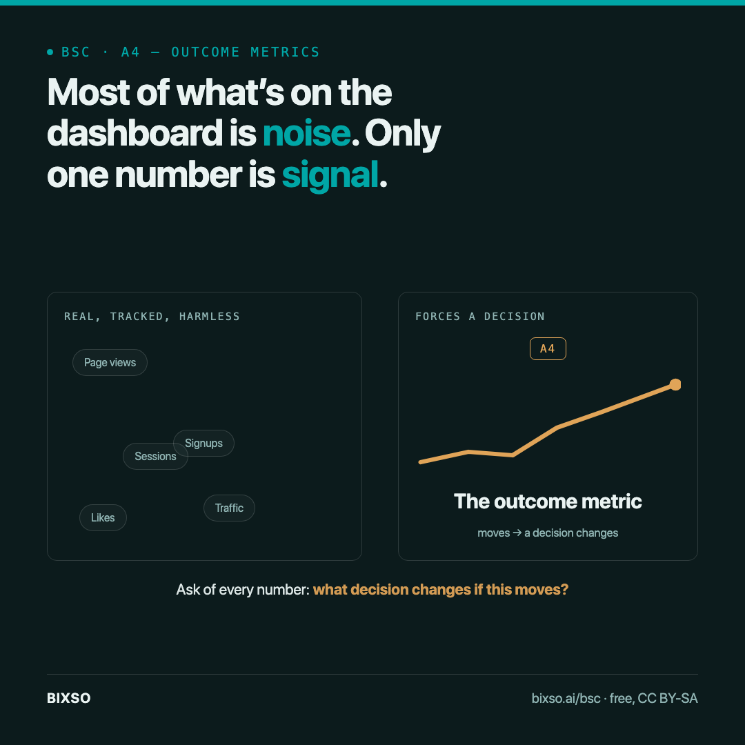
Page views went up. Signups went up. Someone screenshots the chart for the team channel. None of it says whether the business is closer to winning — because a metric going up and a metric that matters are two different claims, and most dashboards make no distinction between them.
Every KPI is a metric, but most metrics aren’t a KPI
Business analyst Daniel Pereira draws the line cleanly: a metric tracks the day-to-day pulse of an activity — organic traffic, support tickets, page views on a campaign. A KPI is narrower and heavier — it’s tied directly to a strategic outcome the business actually needs, and it’s expected to move a specific way or the goal fails. His example is blunt: tracking page views on a landing page is useful, but it’s not a KPI, “no matter how important it is to a company’s bottom line” — because no single decision follows from it moving up or down. A KPI is the number where a move forces a decision. Everything else is context.
That distinction is where vanity metrics live. A number can be real, accurately measured, and still tell you nothing about whether you’re winning — because it was never load-bearing to the outcome in the first place.
The scorecard problem: one number hides which part is failing
The older discipline here — the balanced scorecard, developed by Kaplan and Norton and summarised in Pereira’s guide — exists because a single financial figure can look healthy while the business underneath is not. Revenue can rise while the process behind it is quietly breaking, or while customers are becoming less satisfied, or while the team has stopped learning anything new. The scorecard’s answer was to force four separate views — financial, customer, internal process, and learning — so one green number couldn’t hide a red one sitting underneath it.
Where this lives on the canvas
This is exactly what cell A4 (Outcome metrics) on the Business Solution Canvas is built to force before a number ever reaches a dashboard: which single number, watched at which cadence, actually tells you the model is working — and it has to survive being asked “what decision changes if this number moves?” If the honest answer is “none,” it’s a metric, not the outcome metric A4 asks for.
BIXSO runs this rule on itself in the open: the framework’s own north star isn’t traffic to bixso.ai or followers on a channel — it’s the number of people who actually use the canvas. A visit that never opens the canvas doesn’t count toward it, on purpose, because a visit was never the outcome that mattered.
Run it before the next report
Before the next weekly update gets sent, pick the one number on it and ask what specific decision changes if that number moves next week. If nothing changes, it’s dashboard noise dressed as proof — find the number underneath it that a decision actually depends on, and report that one instead.
The Business Solution Canvas is free and openly licensed (CC BY-SA), one A3 page, no sign-up — A4 exists so the metric that matters doesn’t get buried under the one that’s easiest to screenshot.
Sources: Daniel Pereira, “Business Model Metrics and KPIs” — Super Guide, The Business Model Analyst, Ottawa, 2022 (ISBN 978-1-7387612-2-7): the KPI-vs-metric distinction and the page-views example. Daniel Pereira, “Balanced Scorecard” — Super Guide, The Business Model Analyst, Ottawa, 2022 (ISBN 978-1-998007-11-0), summarising Kaplan & Norton: the four-perspective scorecard method.